There are more options than ever for getting a good, cheap smartphone, and last year’s OnePlus One was a standout. For $300, you got a well-made, nice-looking phone with cutting-edge hardware and few compromises to be found (assuming its 5.5-inch size didn’t put you off). The just-announced, heavily-leaked OnePlus 2 doesn’t deviate strongly from the formula that made the One such an intriguing phone, but there are some notable differences to be found once you dig into the new device.
From a specs perspective, the OnePlus 2 features a 5.5-inch, 1080p screen, a Qualcomm Snapdragon 810 processor, and either 16GB of storage with 3GB of RAM or 64GB of storage with 4GB of RAM. The back-facing camera has a 13-megapixel sensor with optical image stabilization, while the front camera lets you shoot selfies at 5 megapixels. That back camera also includes a two-tone flash and a laser focusing system. While most of these specs are pretty standard fare for a high-end smartphone, the price remains anything but: the 16GB model will retail for $329, while the 64GB version will go for $389. That’s more than last year’s model, but after spending some time with the phone, I feel like the price increase is justified for what you get.
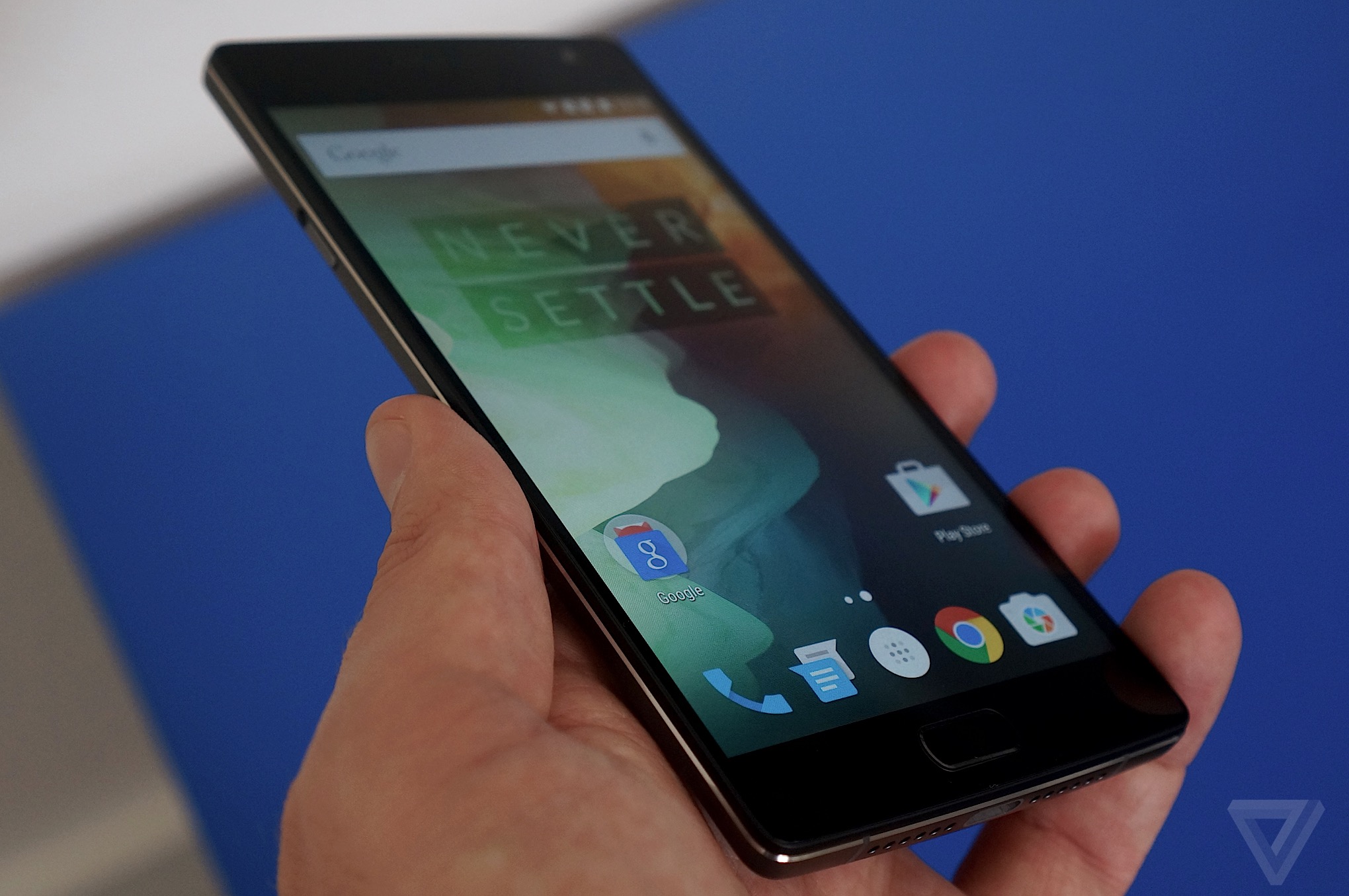
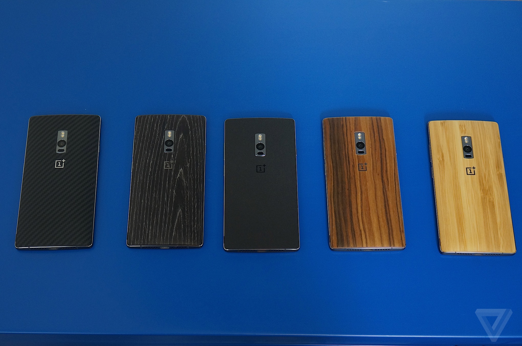
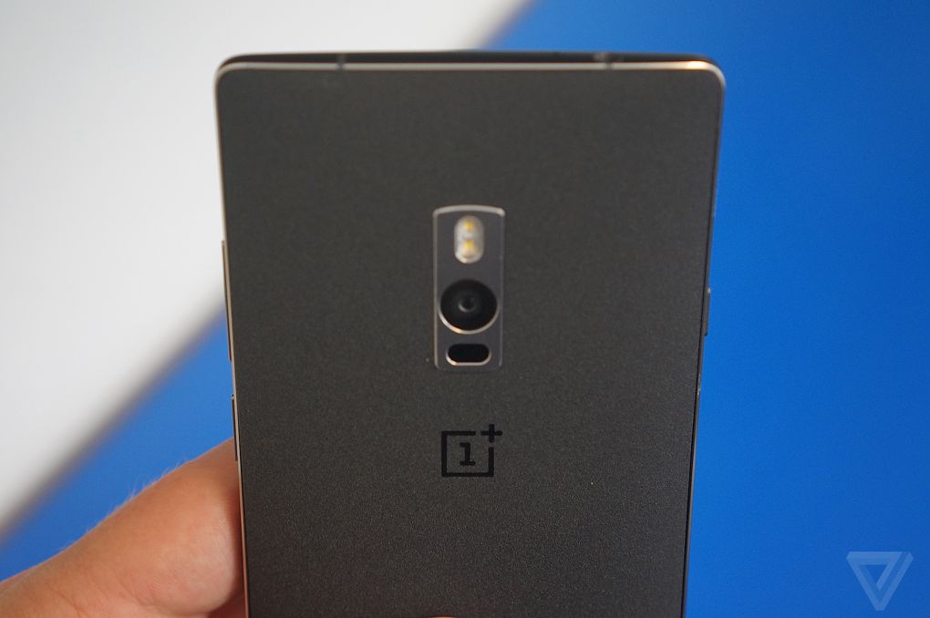
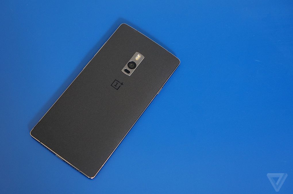
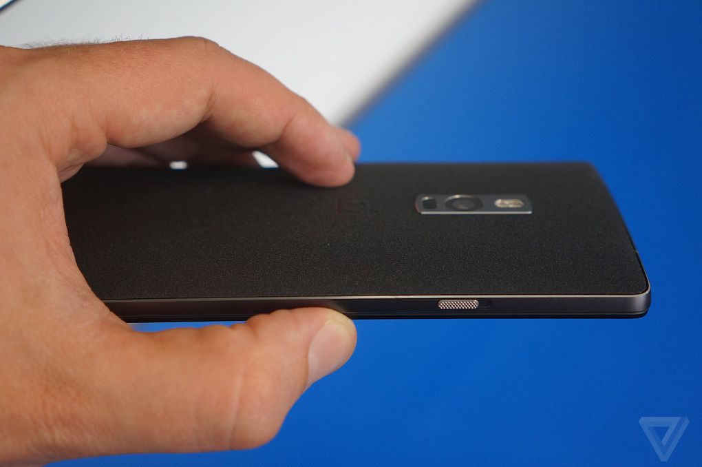
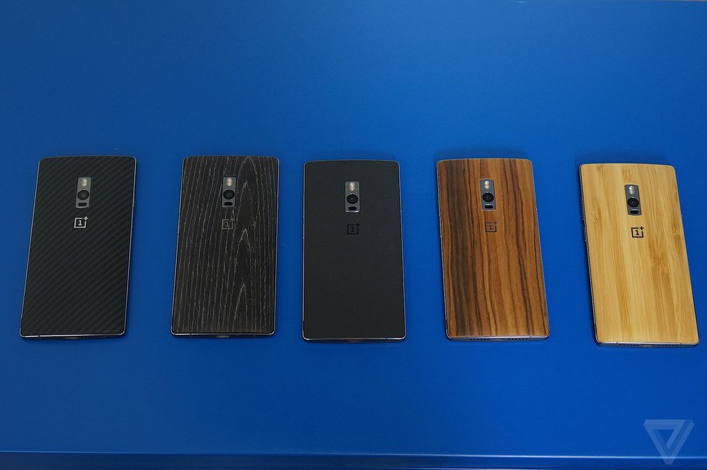
On the surface, the OnePlus 2 is very similar to its predecessor. It’s still the same 5.5-inch device, but the body material is significantly nicer this time — most of the frame is made of aluminum, but the back keeps the textured, grippy material featured on last year’s phone. That back is easier to replace this time; OnePlus showed me a handful of new backs including two wooden options and a kevlar back that brings to mind Verizon’s never-ending parade of Droids. The combo of the unusual textured back with the shiny metal frame looked great to me, and the Moto X-like contour of the phone meant that it nestled into my hand and felt a bit smaller than such a large phone should feel.
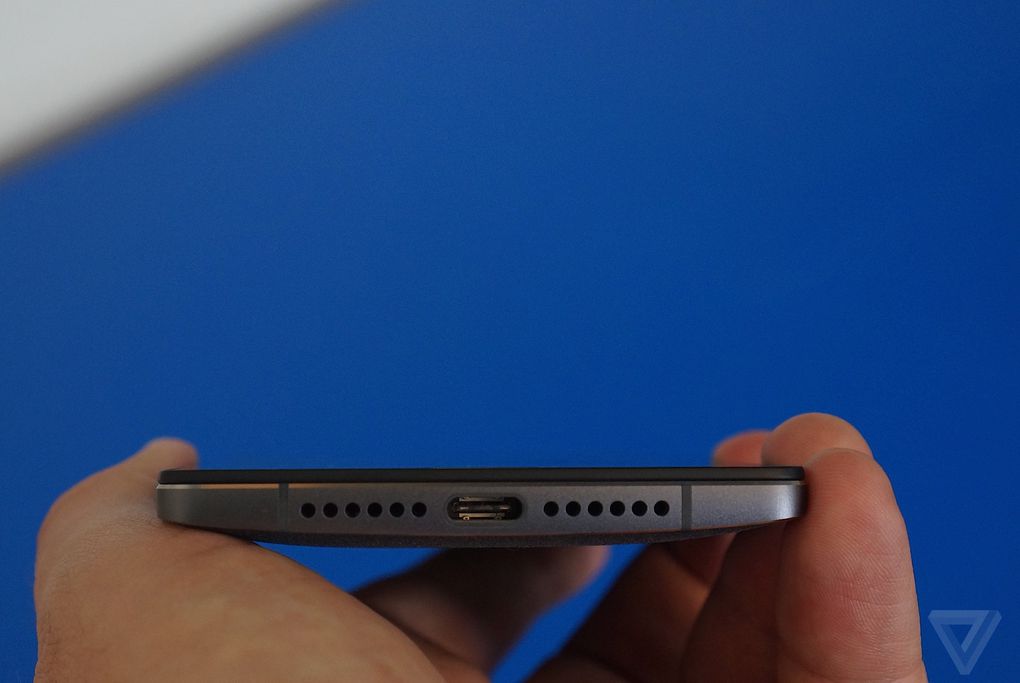
There are a few other hardware tricks you’ll see on this phone that you won’t find on most other devices, perhaps most importantly the USB-C connector on the bottom. We knew this would be the case, but it’s still nice to see a company moving people over to the new port as soon as possible. There’s also a three-position switch on the side of the phone that lets you cycle through the three default notification settings in Android Lollipop (all, priority, and none). I use an iPhone pretty frequently and am very used to using the side switch to silence sounds, so having a more granular hardware switch on the OnePlus 2 is a very welcome addition.
THOUGHTFUL SOFTWARE AND HARDWARE TWEAKS ABOUND
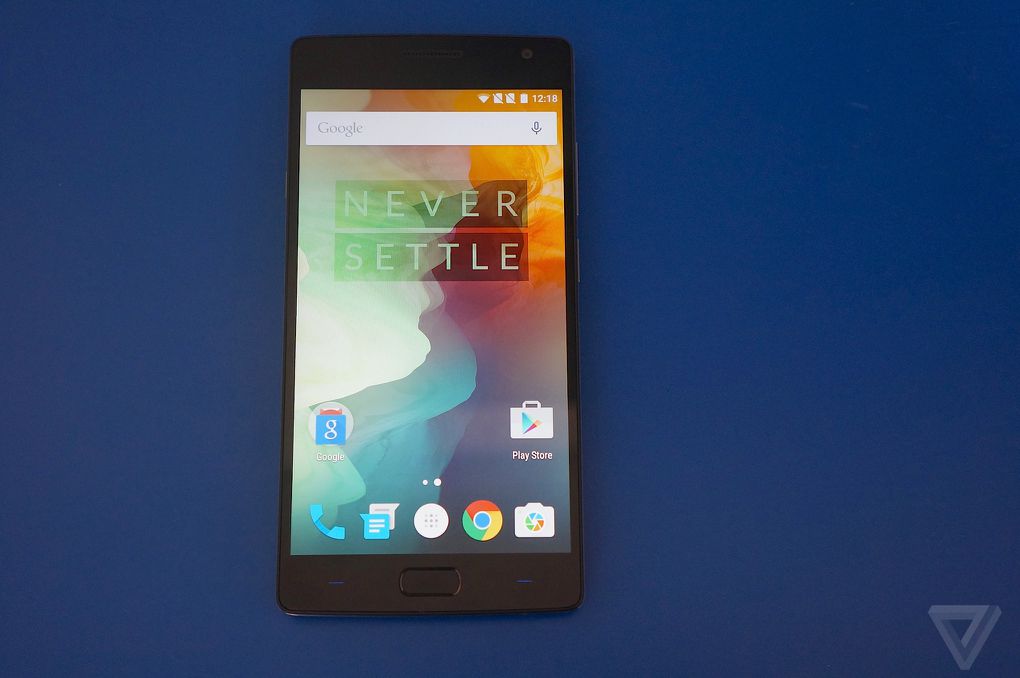
Another new addition is the front-facing fingerprint unlock sensor, and it does indeed work as advertised. With the phone locked, it only took barely a second of laying my finger on the sensor to get the phone open and ready for use. Much like the iPhone, you have to back up the fingerprint sensor with a traditional on-screen lock, but whatever sensor and software OnePlus are using here seem like a very reliable combo.
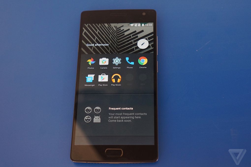
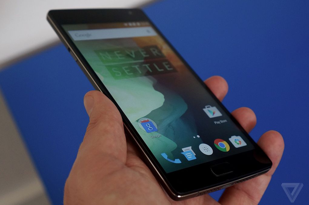
Once you’ve unlocked the phone, you’ll see the very familiar stylings of Android 5.1 — but this time, OnePlus has added its own in-house software (called OxygenOS) over the top, rather than using Cyanogenmod as it did last year. Fortunately, it’s a very clean skin, with minimal extra features — there are some new options included in the settings, like a menu that lets you enable gestures to tap the screen to wake it, or draw a circle on the screen to launch the camera.
YOU'LL HAVE TO GO THROUGH THE NOTORIOUS ONEPLUS INVITE SYSTEM AGAIN, BUT THE PHONES WILL AT LEAST SHIP FASTER THIS TIME
But the biggest addition is something OnePlus calls the "shelf." When you swipe to the left from your home screen, you’ll see an area that collects your favorite contacts and most used apps (Google Now can still be accessed by long-pressing on the home button). OnePlus says it’ll extend the functionality of the shelf over time, but right now it doesn’t really do much worth noting. Hopefully that’ll change by the time this phone gets into consumers’ hands, because right now I’d rather just have Google Now in its default spot.
By and large, though, OnePlus’ software implementation is graceful and minimalist, with thoughtful additions like the ability to swap between on-screen navigation buttons versus using the capacitive buttons below the screen. OnePlus also included its own camera software, which is fast and minimalist; we’ll have to wait until we get to spend more time with the phone to judge the picture quality.
Unfortunately, just like last year, the OnePlus 2 will be available online through an "invite" system — you’ll only be able to preorder it if you get an invite. The good news is that getting an invite will hopefully be easier this time around, as anyone can sign up to receive one on the OnePlus website (among other places, like OnePlus's social media accounts). There’s no telling how long it’ll take to get an invite once you've signed up, but OnePlus knows it needs to move faster than it did last year: the phone will start shipping to the US, Europe, and India by the middle of August.
Hint: Use the 's' and 'd' keys to navigate

No comments:
Post a Comment