Facebook
announces new software to showcase the social network on mobile devices. Read
on to know why I gave the social networking giant’s new software 1-and-a-half
stars.
[If you don’t want to read the whole article
because it’s too long, then read only “The Verdict” part at the bottom of the
article.]
 What is ‘Facebook Phone’? –
The rumours were wrong. The new ‘Facebook Phone’ isn’t a phone. Instead, it’s a
set of apps running the Android operating system. You can download them from
the Google app store onto certain phones from HTC (One and One X) and Samsung
(Galaxy SIII, S4 and Note II). More Android models will be compatible in the
coming months, Facebook says.
Home – This software
suite, called Home, replaces the standard Home screen and Lock screen of the
phone. In their places, what you see is a slowly scrolling parade of
full-screen photos from your Facebook news feed, called Cover Feed. Text-only
posts appear, too, using your friend’s primary profile picture as the
photographic background.
At the moment,
the Cover Feed represents only 80% of what you would see on the actual Facebook
website. What’s missing? Video posts and ads. Both, Facebook says, are coming
soon. This means that your Android mobile screen will soon become a Facebook
advertisement board.
Have fun with Cover Feed –
If the stately scrolling in Cover Feed is too slow for you, you can flick to
reach the next photo, and the next, and the next. You can double-tap the
screen to ‘like’ a post. You can hold a finger down on the screen to see
the entire photo, smaller; big parts of it are generally chopped off in the
process of enlarging it to fill the phone’s screen. And you can tap a tiny
speech-balloon icon to read people’s comments, or to leave one of your own.
 Your droid’s home screen is gone! – The Home software replaces the Home and Lack screens that Google
or your phone maker designed (Don’t worry, this article will tell you how to
get the apps in your home screen back.). Unfortunately, you lose some good
features in this process.
Your profile picture is now the ‘controller’ of your
Android mobile! – The only icon that appears in
Facebook’s Home screen is your own profile photo.
Profile Picture
Controls:-
·
Drag it to the left to open
the Facebook messaging app
·
Drag it to the right to open
the last used app
·
Drag it upwards to open a
grid of app icons on a grey background; this screen is now your mobile app
launcher. But, you won’t find all your apps here. Swipe your finger to the left
to see, all your apps on a black-background. From here, you can hold your
finger down on a particular app’s icon to install it onto the grey-background
launcher screen, which can have multiple pages. Totally, chaotic. The
black-background screen scrolls vertically and the grey-background screen
scrolls horizontally. This is currently the only way in Facebook Home to access
your Android apps.
Say bye-bye to many Android features – Facebook Home is literally destroying the Android operating system
interface.
·
Widgets – Widgets are those
small windows on your Home screen that display news headlines and new email
messages. They’re still accessible, though buried. They appear when you tap
the More button on the black- background app screen.
·
Wallpaper – Wallpapers and Live
Wallpapers, which became business for few people on Google’s Play Store, has
got a smack in its face from Facebook. Wallpaper is gone; you can’t
dress your Facebook Home screen with photo backgrounds of your choice.
·
Status Bar – The bar which sits
on top of every Android mobile, which usually displays the time, you signal
strength, battery life and other gauges. Status Bar appears only when you’re
in other apps.
Facebook-centric features –
The grey-background screen offers buttons that let you write a new post of your
own, take (or choose) a photo to post, or ‘check in’ (announce your location).
Notifications –
Notifications appear in a new style, too. When one of your friends posts an
update or someone comments on one of your posts or sends you a message, a small
white bar appears on your Home screen to let you know. You can tap the
notification box to view the corresponding post or message, or you can hold
your finger down and swipe to dismiss all of them simultaneously.
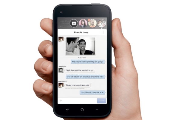
 Chat Heads – The last new
feature in Facebook Home is Chat Heads (Seriously?!). When someone texts you or
sends you a Facebook message, a round icon appears on your screen, displaying
that person’s face (it doesn’t matter what app you are using). Tap the Chat
Head to reveal the new message on a screen that also displays, screen-play
style, all previous back-and-forths with this person.
The Verdict – Everything
in Home is attractive, smooth and quick. At the same time, there’s something
vaguely incoherent about the whole operation.
Facebook Home is
not an operating system and it is not even an app, really. Out of five, I
would give Home 1-and-a-half stars.
Facebook
deserves to be criticized about this step. Facebook is trying to control
Android mobile phones. Home gives us the ability to see Facebook posts on our
phone’s home screen. But, is it worth destroying the Android interface? The
answer is NO.
Now, who knows? In the near future there might
be a Twitter home screen or NBA home screen. Facebook Home is just one attempt
to control a user’s phone without even creating an operating system.(Help was taken from the article “Facebook tries to hit a Home run” by David Pogue for The New York Times.)

No comments:
Post a Comment